
Satellite technology is changing the world, our view, our understanding, our insight into our eco system. At times is feels as if we have God's view of our world.
Though this map could be mistaken, as noted by the writer, as a work of art, these colors may portend further potential damage of our coast line as we contemplate storm surge driven by rising water levels around the world and a warming atmosphere holding more moisture than normal.
It is good, though, to have this visual data. Science is a beacon for us in understanding our current environmental condition. Science is also perhaps our most critical tool in navigating to a more balanced planet.
As with bees (see today's other post), destroying habit (in this case the ocean) kills our wildlife which, every day, every time it happens, threatens equally our existence.
New map of global ocean temperatures is a work of art
By Shannon Hall
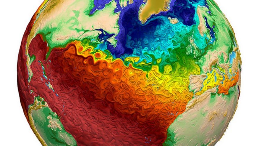
Global water surface temperatures. (Los Alamos National Laboratory)
The paintlike swirls of the visualization, which was released earlier this month by Los Alamos National Laboratory, depict global water surface temperatures. And the resulting image is beautiful.
The simulation is dubbed the Model for Prediction Across Scales Ocean (MPAS-O). It's a variable-resolution model, which means researchers can easily sharpen the simulation's resolution on regional scales (where they have more data). In fact, the map has a resolution of 9 miles in the North Atlantic and 47 miles elsewhere.
MPAS-O uses data from the National Oceanographic Data Center's World Ocean Circulation Experiment — the most comprehensive data set ever collected from the global ocean. For years, researchers sailed the world's oceans and dropped instruments overboard every 35 miles. The instruments measured water temperature and salinity at regular intervals from the surface to the seafloor.
The model itself is only a small part of the U.S. Department of Energy's Accelerated Climate Model for Energy (ACME), which is expected to be the most complete climate and Earth system model once it is finished. The model is being developed with resources from 14 research institutions across the United States, including eight national laboratories.
ACME, which will be created on the country's most advanced supercomputers, will answer questions in three areas that drive climate change: Earth's water cycle, biogeochemistry and the cryosphere (the ice-covered regions of the planet).
No comments:
Post a Comment